Showing posts with label #limitedpalette. Show all posts

Tuesday, February 26, 2019

Packing to Paint in Italy

I will be 70 in a few months, and in March I will use my passport for the first time in my life. I can't believe I am so un-traveled! We will be staying in a villa in Gaiole, Chianti which is near Siena which is in the Tuscany area. We will stay at that villa each of the nine nights we will be in Italy. We will do day trips and excursions from there. We wanted our first trip to Italy to be low-key and relaxing. So no big tours in the major cities - just settling in for a few days and getting to know one small area.

And I want to paint while I'm there! I've spent a LOT of time thinking about what to take in order to be able to paint but not be loaded down with too much luggage. I THINK I have it figured out.  Here's my art packing list:

  • A Masterson 12 x 16 Palette with palette paper inside
  • Water-soluble oil paints (limited palette) which I will wrap individually and place inside the Masterson palette for travel. 
  • 1 tube of Gamblin Solvent-Free Gel (placed inside the Masterson palette with the paints)
  • Brushes in a cloth roll
  • A very lightweight folding easel
  • Three PanelPaks - a 9 x 12, an 11x14, and a 12 x 12.  That's 6 panels. I was originally going to take a 9x12 Ray-Mar wet panel carrier that hols 6 panels - but it is heavier than the PanelPaks. (I may leave the 9x12 PanelPak at home.  If I come home with 4 paintings, that will be fantastic.  I seriously doubt I will do 4 - much less 6!)

Those supplies should easily fit in my suitcase, with plenty of room for my clothes and toiletries. Ron and I will be packing only about 3 changes of clothes each. There is a washing machine in our villa, and we will do a load of clothes a couple times while we're there, and thus we won't need many clothes.

My plan is to sit on the patio of the villa to paint - or inside if it's too chilly to be outside. I've looked at the photos of our villa, and there are plenty of chairs and tables. I can set up the easel, put the palette on one of the tables and sit in a chair to paint. With our excursions, I won't have time to paint more than 6 paintings,  As a matter of fact I'll be surprised if I paint that many! I don't plan on doing any plein air painting away from the villa. So I won't be hauling painting supplies around Italy!  LOL! I will take photos during our sightseeing and exploring, and I will paint from the photos after returning to the villa. I might do plein air painting AT the villa, though. From the photos, it seems to be situated in a very scenic area - with vineyards and gorgeous scenery all around. We'll see. I know how promotional photos can skew reality.

Using water-soluble paints will keep me from having to deal with solvents. I will include the TSA label that all the art folks tell me should be put with the art supplies in the suitcase. The top one is for the Masterson palette box with the water-soluble paints inside, and the other one is for the PanelPaks on the way home when, hopefully, there will be completed painting inside.

Wednesday, January 30, 2019

My Palette

I have learned so much over the past few years as I've taken workshops and classes from so many different artists.  Each of them has his/her own preferred palette of colors.  Kevin Menck has 4 colors - titanium white, cad scarlet, cad lemon, and ultramarine blue.  Kathie Odom has 20 different colors - about 6-8 different reds, blues, and yellows. As I have painted more and more, I've settled on colors that I seem to use more.  I've developed the palette layout that works best for me. It's what I use when I'm at home or doing plein air painting on my own. When I take a class from another artist, though, I tend to use that artist's palette so that I can follow his/her guidance more easily.

I remember hearing an artist that I admire very much comment last year that he can always tell when an artist uses a limited palette because there isn't much vibrancy to the painting. I don't agree with that, but I DO enjoy more colorful paintings. I have proven that I can use a limited palette - and using one has helped me understand color much better.  However, for my own use, I prefer to have more color choices. I like having a couple of each primary color - plus a brown (burnt umber or Van Dyke Brown) and a black (Payne's Gray or Ivory Black), a yellow ochre, and light gray/blue.

On my palette, I place titanium white along the far upper right. Then across the top, I usually keep a cool and a warm red, and a cool and a warm yellow, and, on the top left side, I put a cool and warm blue. Although I can mix purple, I like to have at least one purple simply to save time and  make it easier. And last on the left side are a couple shades of green. The four colors along the bottom are what I call my "modifiers." I use them to modify (darken, lighten, cool down, warm up) other colors.

I keep those basic colors at these locations on my palette.  Then occasionally I switch out colors or add other colors, depending on what I'm painting.  This palette works very well for me.


#marycarolart, #artistpalette, #oilpalette, #limitedpalette, #oilpainting

Wednesday, November 14, 2018

A Workshop with Kevin Menck


This past weekend (Friday, Saturday, and Sunday), I took a plein air workshop with Kevin Menck. As it turned out, there were only four people in the class. So we each received a lot of help from Kevin.

On Friday, we went to Green's Grocery in Leiper's Fork where Kevin did a demo. Then my friend, Sheryl, who was also in the class, invited us to her house for lunch. After lunch we met at Garrison Creek which is the first exit after you get on the Natchez Trace in Leiper's Fork heading west. We looked around the creek, and I picked out this scene to paint. I didn't take a photo while we were outside - I keep forgetting to photograph my painting with the actual scene in the background. I finished it (added the tree reflections in the water - and worked on the foreground a little) in my studio at home. The actual painting looks better than the photograph of the painting. The photograph makes it look grainier.


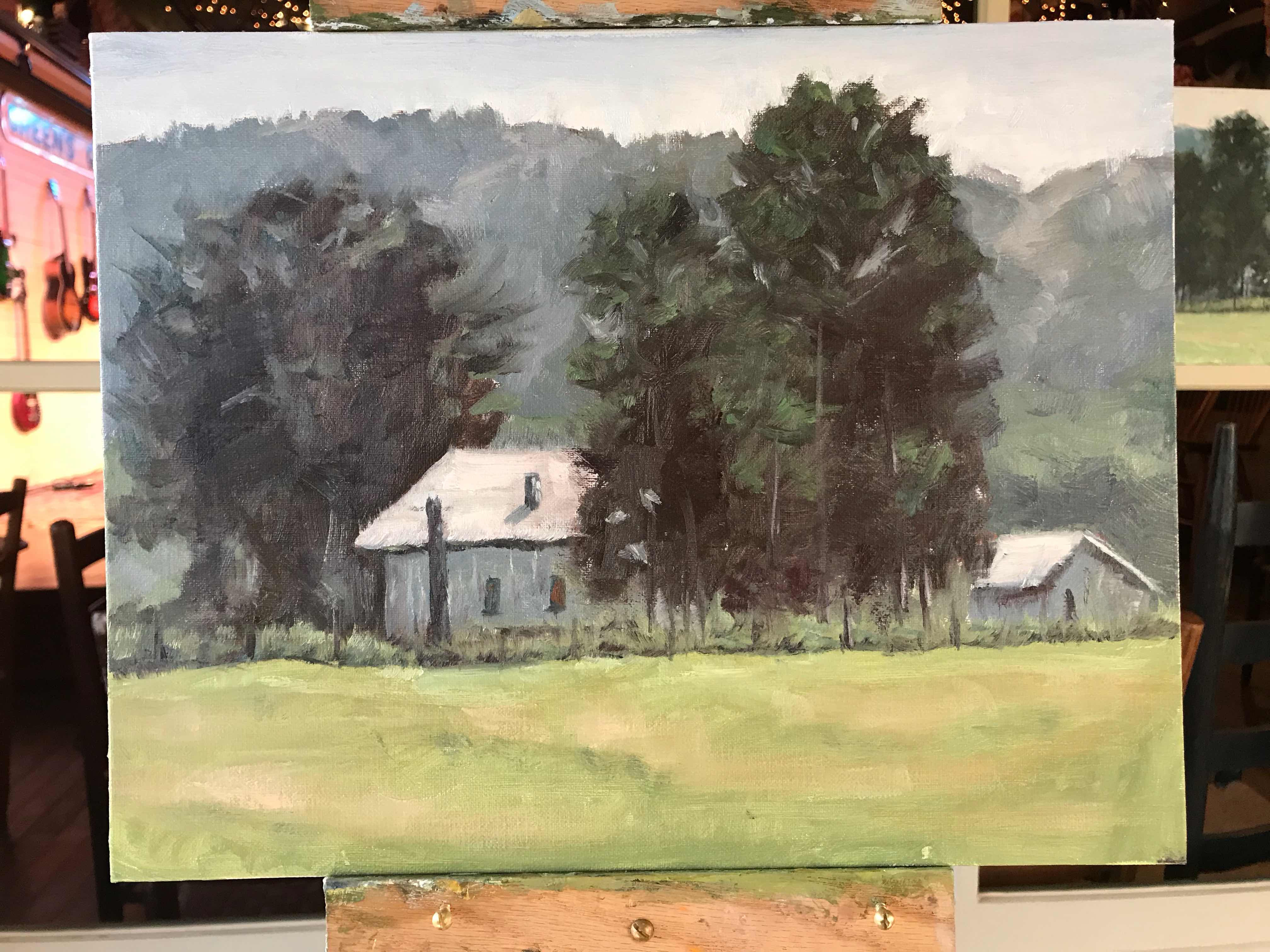
Then on Saturday, we just about froze to death (it was 32 degrees outside) while Kevin did a demo outside on the side of the road entering the Natchez Trace.  We had brought folding chairs - and I happened to have two blankets in the back of my car - so I wrapped one around me and gave the other one to another student.  It was COLD!!!  Ron was nice enough to bring us hot coffee - which was wonderful! We convinced Kevin that after lunch (at Sheryl's again!) we should paint inside. So we met up at Green's Grocery again in Leiper's Fork, and we each painted using one of Kevin's paintings as a reference. I chose a painting that had a house and barn - and here is my version of it. It's my favorite painting from the workshop.


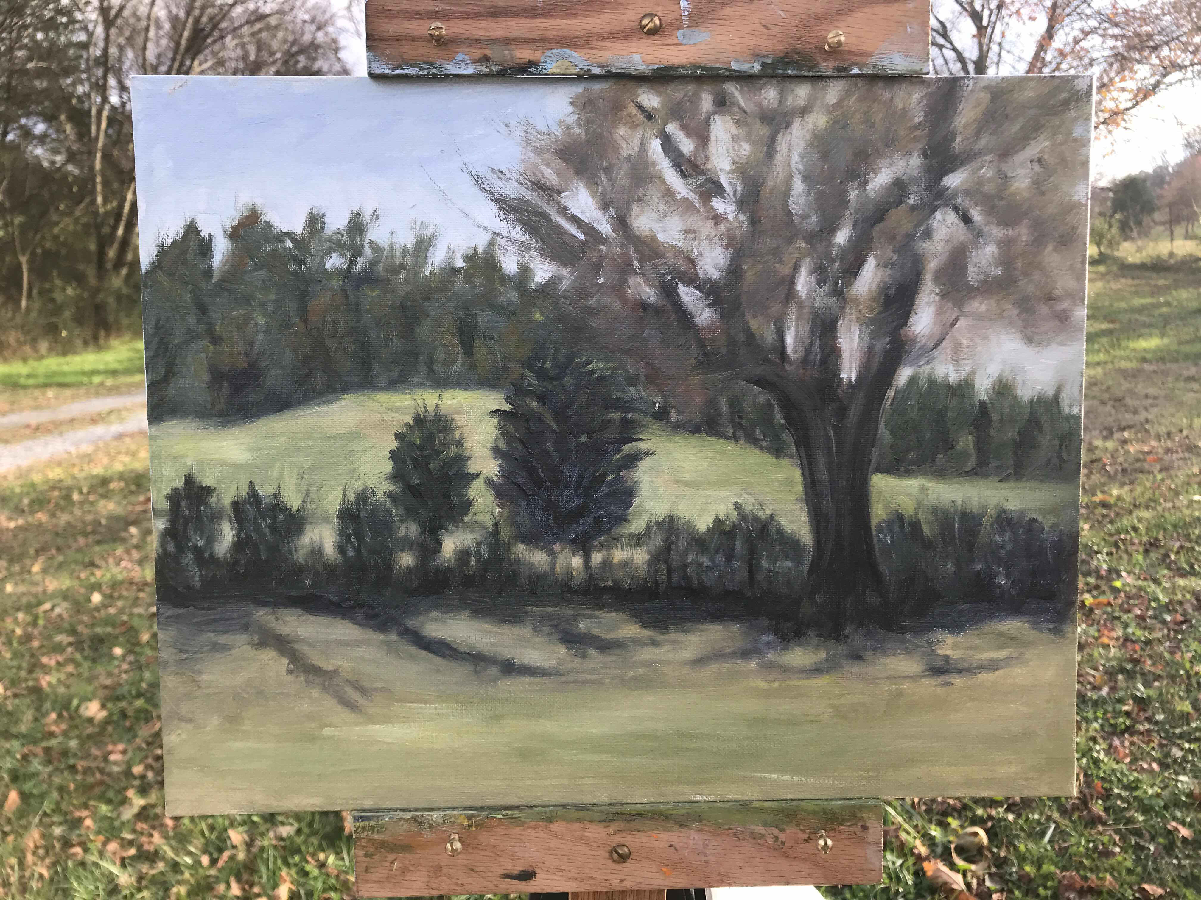
Sunday was a much better day in terms of weather - warmer and sunny.  We went to a farm on Bailey Road in Leiper's Fork. I chose a fence row with a large tree in the foreground and a pasture and some hills in the background.  It's my least favorite painting for the workshop. That large tree was my nemesis for the day. Since it is November, most of the leaves had fallen off, but there were still some hanging on - and I had the hardest time showing that in the painting.  I painted it, scraped it off, and painted it again.  I like the play of shadows in the foreground which was one of the reasons I chose that scene. I had told Kevin my goal was to paint the scene entirely from looking at the actual scene - and not taking a photo and looking more at the photo than the scene. So I accomplished that. I didn't look at a photo of the scene at all; it was painted entirely en plein air.  


This was my second Kevin Menck workshop.  I like his style of painting, although I'm probably a little tighter of an artist than he is.  He's good at helping me to be a little looser - to concentrate of big shapes and values rather than getting bogged down with unnecessary details.  It was a good workshop.

Monday, February 12, 2018

In Mother’s Arms

Back in 1975, Larisa was a baby, and Ron took this photo of me holding her on the porch at our house on Indiana Avenue in Atlanta.  Today I decided to paint that photo. Here is the original photo:


Below is the painting after getting the main values blocked in.  In this painting, I used only two colors:  burnt umber and titanium white. I set up 6 different values of burnt umber and white on my palette.  I wanted the painting to have a sepia look since it's a 43-year old photo.


This is how I left the painting for tonight.  There are still more tweaks to be done - mostly on Larisa's face and head.  I'm going to take it to art class on Friday to see what suggestions Rachael can give me. 


I really love it - mostly because I remember that photo being taken, and because I love that sweet baby so much - even though she's a mother now of her own two children.  I will definitely be working on a poem to go with this painting.

(Later) I've been working on the poem and have tentatively finished one.  I'm considering going in another direction with the poem - making it more personal to Larisa and me.  However, here's what I have for now:

 In Mother’s Arms

In Mother’s arms - Held close, held dear
In Mother’s arms - There is no fear. 

In Mother’s eyes - Beauty profound
In Mother’s eyes - Grace unbound

In Mother’s heart – love beating strong
In Mother’s heart - where you belong

~Mary Carol Shaw Johnston~


NOAPS 2021 Associate Member Online Exhibition

I'm happy to say that my painting, "Bear Creek Road Reflections" was chosen to be in the 2021 NOAPS (National Oil and Acrylic ...